AI in trail races
Recently I attended a trail race and took a wrong turn 2km before the finish. I realized many of us did the same, so I decided to shed a bit of light on a situation that would probably just go unnoticed and keep repeating.
My opinion was that at that point the markings were ambiguous because we pass the point twice, each time in a different direction - but I needed data to confirm that it wasn't just my incorrect judgement at that moment.
Data
There were 114 starters, and I could find only 45 activities on Strava, which could be a big enough sample to derive a conclusion. I did this manually; they allow you to download the gpx version of the activity, which includes only the GPS coordinates of it without any data like heart rate and time. I also extracted the Elapsed time metric just to have the average speed of each runner and not end up with 45 dots racing each other all at the same speed.
There are two types of people in this world:
- Those who can extrapolate from incomplete data.
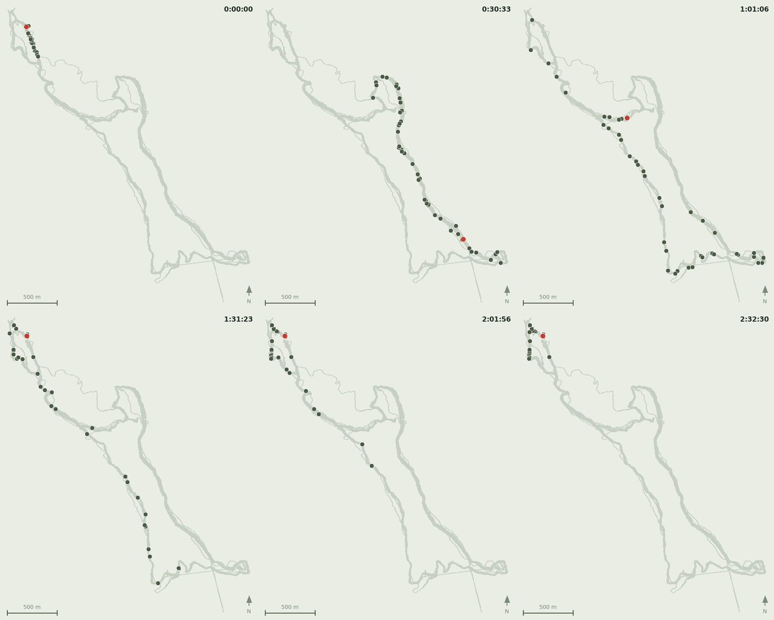
I imagined an animated image of all activities would help me see how many people made the same mistake. What would have taken me a week in the past, Claude Code did in a few minutes.
The result
In the produced animation, I could see a few isolated cases of taking a wrong turn, but also at least a third of all runners doing the same mistake that I did. You can see where it happens.
Conclusion
This is a very simple example of how we can improve our local trail races and how AI makes it easier to use what we already had in hand years ago, but it was complex and was taking too much time to do.
P.S. Visit the race - it offers trails ranging from the forests around Radika River to the sunny slopes of Mount Krchin.